
If you use WordPress, you’ve probably already heard of Gutenberg, the block editor that became the default editor a few years ago. In this article, Gutenberg: the complete guide at the WordPress editor, we’ll see what the differences are with the classic editor and how to disable Gutenberg.
We’ll see how to use Gutenberg step by step, starting with adding blocks and ending with the editor settings.
We’ll take a look at how to navigate between different types of blocks, how to use templates, groups and reusable blocks and how to copy content from a text editor to the block editor.
We’ll also see how to convert content created with the classic editor into Gutenberg blocks and how to use the classic editor within the new one. In conclusion, we’ll also discover how to extend Gutenberg’s functionality with additional plugins.
Table of Contents

What is Gutenberg
With the release of WordPress version 5.0 on December 6, 2018, Gutenberg became the default WordPress editor and replaced the classic TinyMCE editor.
Unlike the classic editor, Gutenberg works in blocks. This means that each element of our page or article is represented by a block: paragraphs, headings, images, each of them consists of a separate block.
Disable Gutenberg
After three years since its release, there are those who prefer to continue using the classic editor. Besides, there are cases when the themes or plugins in use are not compatible with the new editor and you may want to continue using the classic one.
In other words, there are those who find the block editor more complex to use and prefer, to continue using the classic version. Whatever the reason that leads you to want to disable it, let’s see how to return to the classic WordPress editor.
How to disable Gutenberg
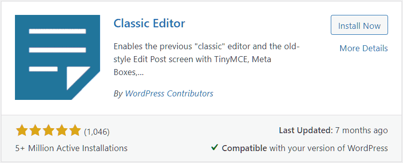
To restore the classic WordPress editor you can use a simple plugin: Classic Editor. Remember that officially support for this plugin would end on December 31, 2021.
To disable Gutenberg, we install and activate the Classic Editor plugin.
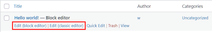
Therefore, when we go to create a new article we’ll be dealing with the classic WordPress editor.
Switch between editors
If you have activated Classic Editor plugin you can easily switch between editors. Just open the writing settings (Settings → Writing from the WordPress sidebar) and choose which editor to use by default.

From these settings you can also choose whether or not to allow other users to switch between editors.
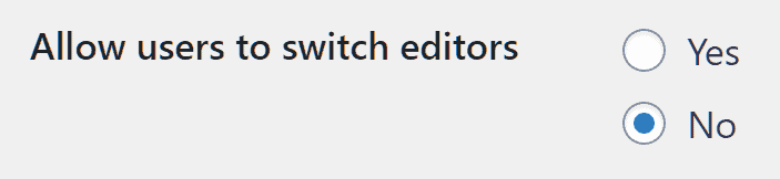
By enabling this option, users will be able to choose which editor to use to edit articles and pages on the site.
An overview of the classic editor
The classic WordPress editor is very similar to a traditional Word Processor. In the top bar you can enter the title of the article, while the central area of the editor allows us to create the content.

The content can be formatted by acting on the buttons on the top bar, which are shown here:

- 1) It allows us to set the text portion as a paragraph, title or pre-formatted.
- 2) Turn on bold, you can also use the key combination Ctrl +B.
- 3) Enable italics, you can also use the key combination Ctrl +I.
- 4) Add a bulleted list.
- 5) Add a numbered list.
- 6) Add a citation.
- 7) Align text or images to the left.
- 8) Align text or images in the center.
- 9) Align text or images to the right.
- 10) It allows you to insert a link, you can also use Ctrl + K.
- 11) Insert the tag Read more.
- 12) Show an additional toolbar.
- 13) It allows us to activate the distraction-free writing mode.
The additional toolbar, gives you access to more formatting options and also allows you to undo and redo the last action done on the text. Let’s take a look at all the functions:

- 1) Activate the strikethrough.
- 2) Insert a horizontal line.
- 3) It allows us to change the color of the text.
- 4) Paste as text.
- 5) Clear the formatting.
- 6) It allows us to insert special characters.
- 7) Reduce re-entry.
- 8) Increase re-entry.
- 9) Undo (Ctrl + Z)
- 10) Repeat (Ctrl + Y)
- 11) It allows us to display keyboard shortcuts.
By clicking on Add Media we can open the WordPress Media library and insert images, videos and so on.

The default display mode is Visual, but we can switch to the HTML editor by clicking on Text.

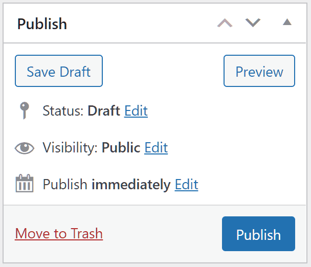
To the right in the editor we have the publishing options that allow us to preview the article, save the draft, publish or schedule the post.
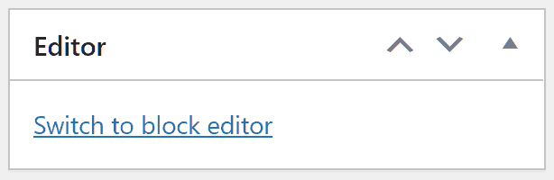
From these sections we can also set the category, tags and featured image. In addition, we can also quickly switch to the block editor (if we have enabled the setting as we saw earlier).
Convert content from the classic editor to the block editor
If you decide to switch to Gutenberg, but had created content with the block editor what would happen next?
In this case, when you go to edit content that you had created with the block editor, Gutenberg inserts all the content in one classic block as you see in this example below:

At this point you have two choices. The first is to leave the content in the classic block which works exactly like the classic WordPress editor.
The second one is to convert the content into separate blocks. To do this you just need to click on Convert to blocks as shown in this screenshot.

Using the classic editor within Gutenberg
As you may have already guessed you can also use the classic editor within Gutenberg. To do this you just need to add a classic editor block as you see here.

You’ll then be able to create the entire contents or part of the article as if you were using the classic editor.

The Gutenberg interface
The block editor interface has elements arranged in three main sections.
The first section is the top bar that allows us to see all the available blocks, switch between edit and select modes and quickly access the publishing options.
The Gutenberg sidebar is activated or deactivated by clicking on Settings (gear icon). The central area of the editor, on the other hand, is where we go to create content.
Gutenberg’s top bar
Let’s take a look at all the tools on the top bar in detail.

1) The WordPress symbol allows us to return to the backend of our site. If you have not saved your draft article you will be notified that changes may not have been saved.
2) The “+” symbol allows us to display on the screen the block inserter that gives you access to the blocks (divided by categories), and to templates and reusable blocks if present. Later on in this article, Gutenberg: the complete guide at the WordPress editor, we’ll talk about reusable blocks and see how to create and insert them.
3) The Tools button allows us to switch between Edit and Select modes.

4) It allows us to undo the last change, you can also use the key combination Ctrl + Z.
5) It allows us to restore the undone edit, you can also use the key combination Ctrl + Shift + Z.
6) The Details button gives us information about the text: number of characters, words, titles, paragraphs and blocks.

7) The list mode allows us to navigate more quickly through the contents of our article, showing us the list of blocks we have inserted.

8) Click on Save Draft or Save as Pending to save the changes made to the article. In the first case a draft will be created, in the second the article will be put in the Pending articles list. If the article has already been published you’ll see, instead, the button Convert to Draft that allows us to put the article back in the drafts.
9) By clicking on Preview we can view our article before publishing it.
10) By clicking on Publish / Schedule we can publish the article or schedule it for the date we have defined. We will see later how to schedule an article. If the article has already been published you will see, instead, the Update button that allows us to update the article already published after making changes.
11) By clicking on Settings we can enable or disable the Gutenberg sidebar. In the sidebar we can find two tabs: Article and Block. We will talk about the Block tab when we look at block settings, while in the section Articles and pages settings we can see what options we find in the Article tab.
12) By clicking on the three vertical dots (⁝) we can access the Options. Let’s see what settings are available there.
View
By default the block toolbar is shown above each block and only when the block is selected. In some cases we may want to display it always on the screen, to do so we just need to select the Top Toolbar option at the top.

Spotlight Mode helps us focus on a single block at a time.
When we create an article with the block editor, by default the WordPress navigation menu is hidden. To continue to see it while creating the article we just need to click on the options (⁝) and turn off Full Screen Mode.

Editor
From here we can switch from the visual editor to the code editor.
Tools
By clicking on Block Manager we can choose which blocks to show and which to disable. This helps us simplify the search for blocks, especially if we use many extensions that allow us to increase the blocks at our disposal.

By clicking on Manage Reusable Blocks we can access the individual reusable blocks we have saved, edit, delete or export them. From this section we can also add a new reusable block or import them from a JSON file.

By clicking on keyboard shortcuts we can access the list of all shortcuts.

From the editor options we can also start again the Welcome Guide that explains how to take the first steps with the block editor.
By clicking Copy all content we can quickly copy all the content in the editor.
The Help button allows us to open the WordPress.org documentation on the editor.
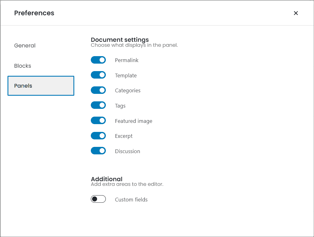
To top it off, the Preferences let us choose whether to display the most used blocks and let us customize the sidebar.
Gutenberg: article and page settings
Let’s conclude the section about Gutenberg’s settings by seeing what the options are for publishing.
Remember that the Post tab becomes a Page when we are creating or editing a page instead of an article. Let’s see what are the options for articles and the options for pages.
Status and visibility
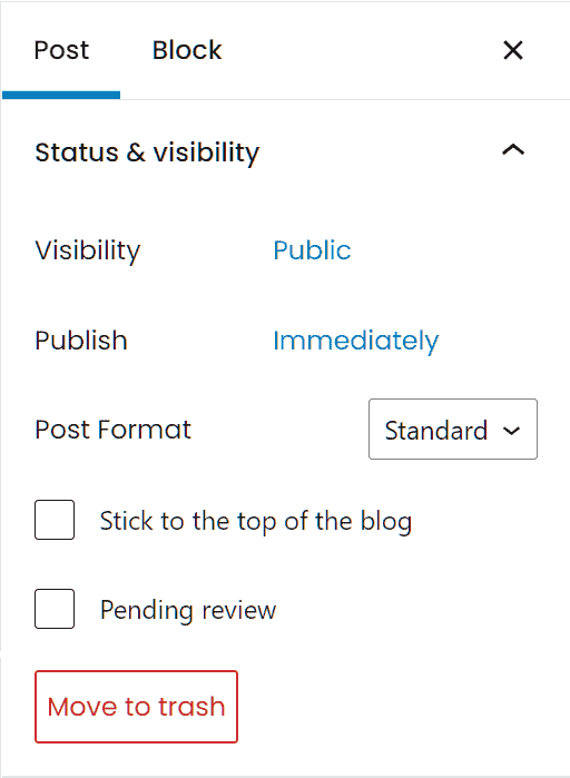
Visibility
From this section we can change the visibility of our article. The default option is “Public“, when the article is published it will be visible to anyone.
We can also choose to set it as “Private“, in this case it will only be visible to administrators and editors. The “Password Protected” option allows us to set a password to protect the article.
Publish
We can choose when to publish the article. The default option is Immediate, but we can click on the date to open the calendar and choose a different date.
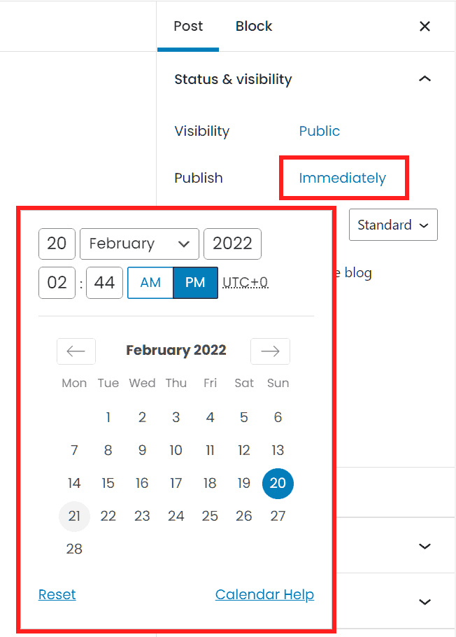
WordPress allows us to schedule an article, setting a later date for publication, it and also allows us to backdate it by entering an earlier date.
Item format and other status and visibility options
We can choose to set a format other than the standard one. We can also choose whether to select the Highlight option at the top of the blog to highlight an article or set the article as Pending Review.
Permalink
From here we can edit the article URL.
Categories
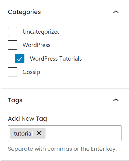
We can choose one or more categories for our article. Remember that if you don’t set any category the default category will be selected.
You can change the default category for articles from the writing settings, if you don’t know how to do that you can follow the step by step procedure in our WordPress tutorial.
Tags
From this section you can insert one or more tags.
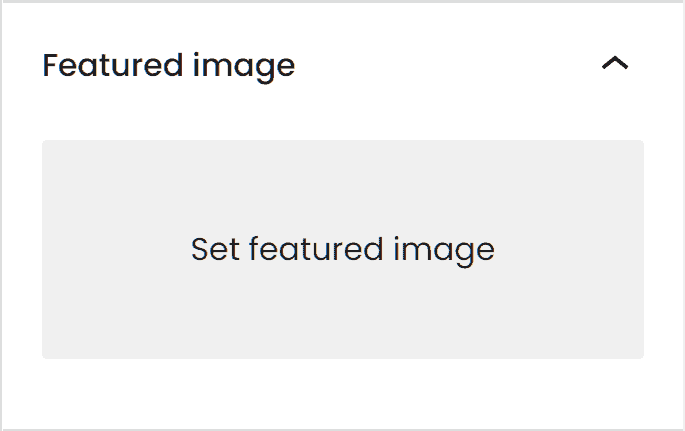
Featured Image
WordPress allows us to choose an image to use as the featured image of the article. This image will be shown in the blog category, home page, or in the list of related articles according to our WordPress theme.
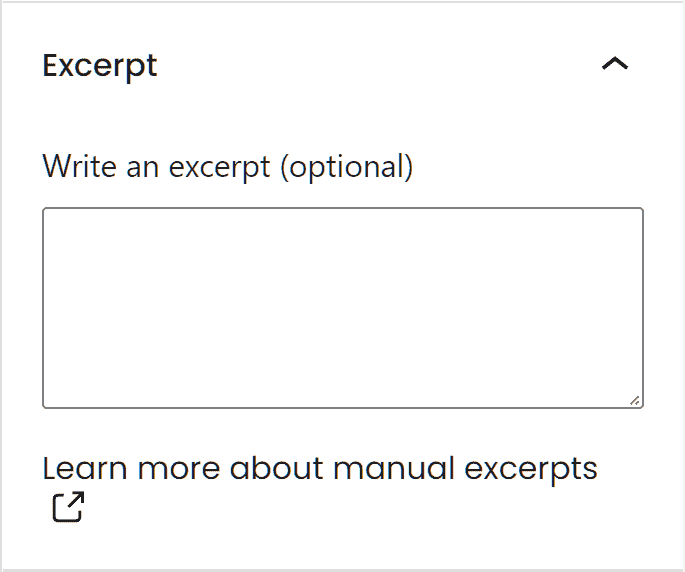
Excerpt
In this section we can insert a brief summary of our article. This is an optional field that can be displayed in the archive or on the search results page depending on the theme in use.
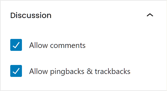
Discussion
From this section we can choose whether to enable or disable comments, pingbacks and trackbacks.
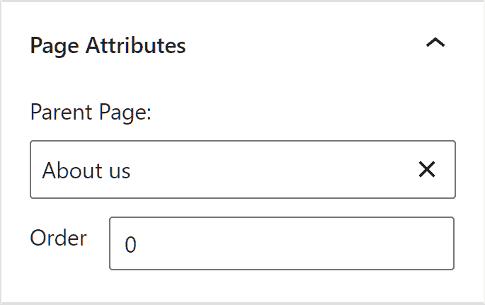
Page Attributes
This section only appears on pages and allows us to create a hierarchy between different pages by selecting a parent page.
Create content with Gutenberg or import it from other editors?
To create articles and site pages with Gutenberg we can write our content directly from the editor or use an offline Word Processor (Microsoft Word, LibreOffice or Pages) or in the cloud like Google Docs.
In this case, after writing our article, we just have to paste it into the editor and it will be converted directly into blocks.
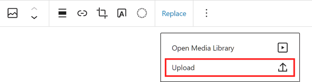
In particular, if you use a tool like Google Docs remember that if your article contains images, they will not be loaded directly into the library. In this case you will see the images in the editor, but they will continue to be used as external resources.
The best thing to do is to click on the Upload an external image button to upload the image to your site’s library. This way if the image is moved from its original location or being deleted you don’t risk it not being visible on your site anymore.
An Introduction to Gutenberg Blocks
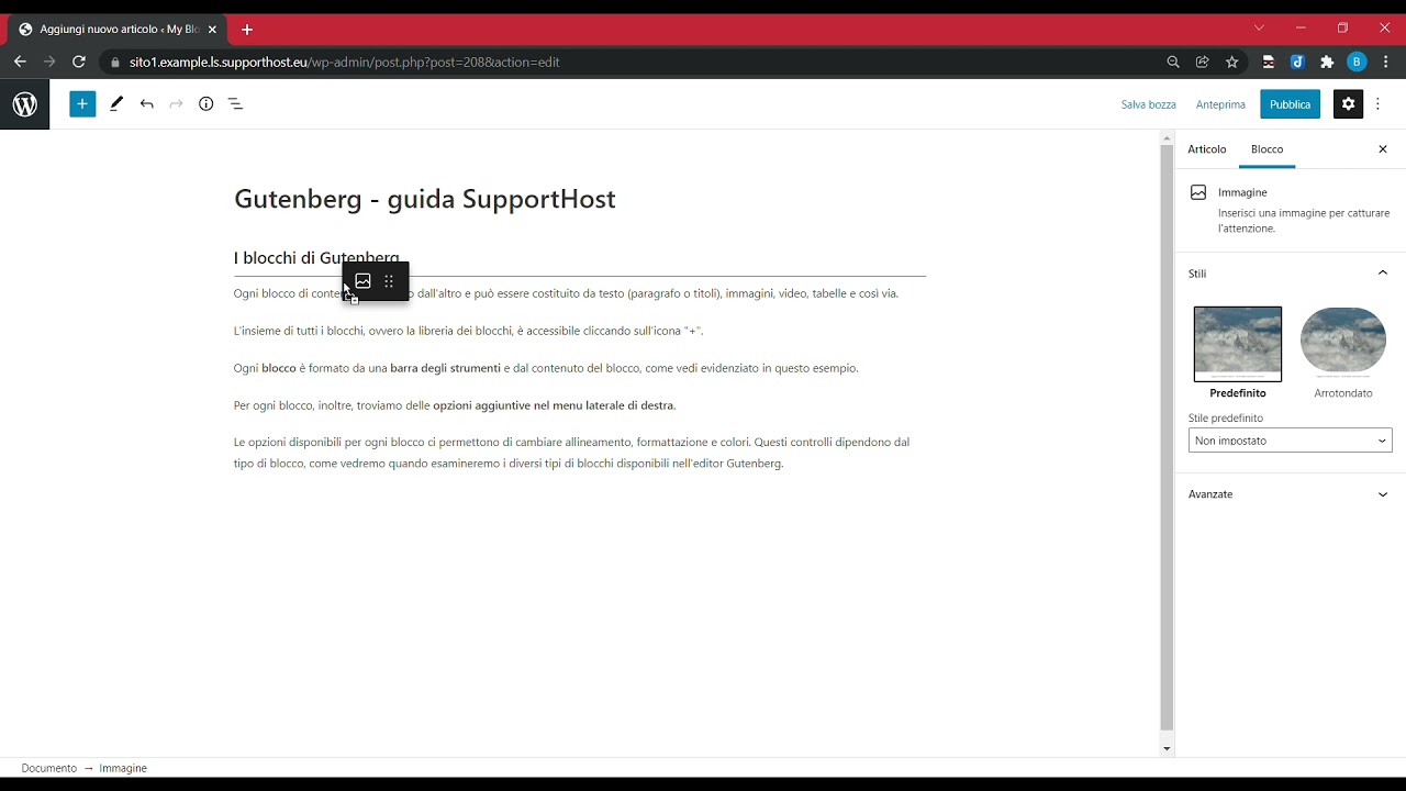
Each content block is different from the other and can consist of text (paragraph or headings), images, videos, tables, and so on.
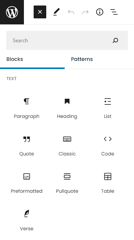
The set of all blocks, i.e. the block library, can be accessed by clicking on the “+” icon.

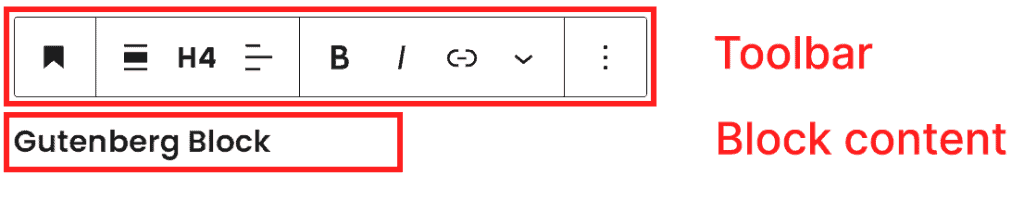
Each Gutenberg block consists of a toolbar and the content of the block, as you see highlighted in this example.
For each block, we can also find additional options in the Gutenberg sidebar.
The options available for each block allow us to change alignment, formatting, and colors. These controls depend on the type of block, as we will see when we examine the different types of blocks available in the Gutenberg editor.
Add a block
There are several ways to add a new block on Gutenberg, as you can see in this example video.
Method 1
To add a block we need to click on the “+” icon on the right in correspondence to an empty block and choose the type of block to insert.
Method 2
We can use the block inserter from the top bar of the editor, as you can see in the video above. In this case in the inserter we will find the list of all types of blocks divided by categories. We can also search for a specific type of block using the search bar of the inserter.
Method 3
We can click on the “+” icon present between blocks to add an intermediate block, as you see in this example.

Method 4
In an empty block we can type “/” followed by the block type. For example, to insert an image we just type “/image” and press Enter to add a block of type image.
Method 5
We can click on the three-dot icon (⁝) in the toolbar of a block and from there select one of these options:
- insert before, to insert a block before the current one
- insert after, to insert the new block after the current one.
Move Gutenberg blocks
When we select a block on Gutenberg, we can move it in several ways as you can see in this short video.
Move up or down
We can move a block up or down using the two arrows that appear in the block toolbar.
Dragging a block
After selecting a block we can drag it from one position to another. To do this we just need to click on the Drag button you see highlighted in this screenshot, and then drag the block to the desired position.

Move to option
To move a block, we can also click on the three-dot icon (⁝) from the toolbar of the block to be moved and then click on Move To.
We’ll see a horizontal blue line appear, we just have to move it to the desired position using the directional arrows and then press Enter to confirm the move.
This last option is especially useful when we need to move a block within a page or a very long article.
Remove a block
To remove a block we just need to select it, click on the three vertical dots (⁝) and click on Remove Block.

We can also select the block and use the key combination Shift + Alt + Z.
Types of blocks
Let’s go over the most common Gutenberg blocks in detail:
Paragraph block
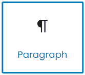
Let’s take the paragraph block as an example and see what options are available in the block toolbar and the block settings in the sidebar.
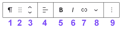
The Paragraph Block Toolbar
1) Change block type or style: This option, besides showing us the type of block in use (in this case paragraph), allows us to transform the paragraph block into another one. We can choose between these alternatives:
- title
- list
- citation
- buttons
- columns
- group
- pre-formatted
- highlighted quote
- verse.
2) Drag: allows us to drag the block as we saw in the section on how to move Gutenberg blocks.
3) Move Up and Move Down: the up arrow allows us to move the block one position up, as we have seen it is one of the methods to move our block. The down arrow allows us to move the block downwards.
4) Change text alignment: allows us to change the alignment (left, center or right).
5) Bold: activate bold. Alternatively we can use Ctrl + B.
6) Italic: activates italics. Alternatively we can use Ctrl + I.
7) Link: allows us to insert a link. Alternatively we can use Ctrl + K.
8) Other: this function, for the paragraph block, gives us access to additional formatting options. We can insert text as a superscript, subscript, strikethrough, inline code, change the color of the text or insert an image in line with the text.
9) Options: by clicking on the icon (⁝) we can access other options. Keep in mind that these options are identical for all types of blocks.
- Copy: to copy the selected block.
- Duplicate: to duplicate the block.
- Insert first: allows us to add a new block before the current one.
- Insert after: allows us to insert a block just below the selected one.
- Move to: allows us to move the selected block.
- Edit as HTML: allows us to edit the block as HTML. To return to the default option we just need to click again on the three dots and then on Edit visually.
- Add to reusable blocks: allows us to save the block among the reusable blocks, we will see in the next paragraphs how to do it and how to insert the reusable blocks in the article.
- Group: by selecting multiple blocks and clicking on Group we can transform the blocks into a single group. We will devote a section to how to use groups.
- Remove Block: allows us to remove the block.
Paragraph block settings in the sidebar
As we saw earlier, the Gutenberg sidebar features two tabs: Article and Block.
If you don’t see the sidebar just click on the gear icon.

The settings in the sidebar change depending on the type of block. Let’s see which ones are available for the paragraph block.

Typography
In the typography section we can change the font size from the default options or set the font size in pixels.
If we want to reset the size to the default size we just click on Reset.
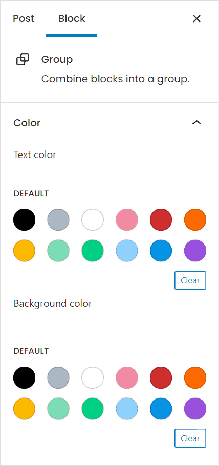
Color
From this section we can change the color of the text and the background of the paragraph.
We can choose from the colors shown or click on Custom color to open the color selector. From here we can also choose the color by entering the corresponding hexadecimal value.
Text Settings
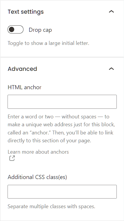
From this section we can choose whether to set the Drop cap, which makes the first letter of the paragraph large.

Advanced
The advanced settings allow us to add one or more CSS classes to our block. From here we can also create an HTML anchor.
By creating an HTML anchor we can then insert a link within our article that points to the block corresponding to that anchor. This allows us to redirect the reader to a specific point in our article such as a paragraph, title or image.
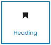
Heading block
The heading block allows us to structure the text within our article or page into subsections.
Subsections are important to make the text more readable and allow the reader to find the information they are interested in right away. You can learn more about the most important aspects of creating an article by reading our guide on how to write an article for a blog.
To add a title block, we can click on the “+” icon and click on Heading, or we can type “/heading” in a blank block and press Enter.
Another quick way to enter a heading within Gutenberg is to type “##” and press space, this allows us to enter an H2. To change the level of the header, simply type a corresponding number of erasers (### for H3 and so on).

The title block toolbar
Let’s see what options Gutenberg provides us with for titles:
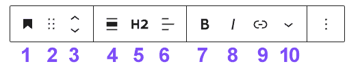
1) Change Block Type: a title block can be changed to a paragraph, bulleted list, citation or highlighted citation, columns or group.
2 and 3) Drag, Move Up and Move Down: allow us to move the block.
4) Change the alignment: according to the theme we can choose between width and full width.
5) Change header level: from here we can change the header level (tag header H2, H3, etc)
6) Change text alignment: we can align the text to the center, left or right.
7) and 8) Bold and italic
9) Links: we can insert a link.
10) Other: from here we can access the other formatting options as we have seen in the case of the paragraph.
Title block settings in the sidebar
The additional title settings allow us to change the font size and manage the color options for the text and background.

From the advanced section, we can also add an HTML anchor and additional CSS classes.
Image Block
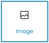
The image block on Gutenberg can be added just like any other type of block. You can click on the “+” icon and then select “Image” from the list, or you can type “/image” in a blank block and press Enter.
After adding the block, we can upload an image by clicking Upload or dragging it to the block area. We can also choose an image already in the WordPress media library or enter the URL of an image.
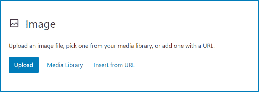
After inserting an image, we can add a caption by clicking on the “Add Caption” text that appears just below the image.

As we said, each block shows us different options in the block toolbar and sidebar settings, let’s see which are the ones for the image block.

The Image Block Toolbar
The Image Block toolbar gives us these options:
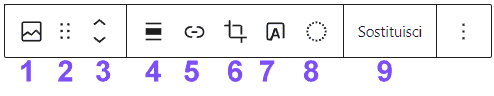
1) Change block type: an image block can be transformed into gallery, cover, file and media and text. This option also allows us to transform blocks into columns and groups, as we will see later.
2 and 3) Drag, Move Up and Move Down: like the other blocks, images can be moved using the methods we saw earlier.
4) Align: images can be aligned in the page and, moreover, we can choose whether to show them at width or full width.
5) Insert link: we can insert a link so that clicking on the image will open a certain page (for example, the original media file).
6) Crop: by clicking on the crop button we can crop or rotate the image.
7) Add text on the image: you can insert some text on the image, so the image block will be transformed into the cover block.
8) Apply two-color filter: we can apply a color filter to the image directly from the editor.
9) Replace: this function allows us to replace the image with another present in the library or to load a different one to replace it.
The image block settings in the sidebar
In the Gutenberg sidebar, by clicking on the “Block” tab, we can find more settings for our images.

Styles
Depending on the theme we are using we’ll find different options to change the style and choose whether to show borders, frames or crop the image so that it has a rounded shape.
Image Setting
From this section we can insert the alternate text of the image and change the size. Check out our article on optimize images for SEO to learn more about image attributes.
Advanced
The advanced section allows us to insert the title attribute for the image, create an HTML anchor and insert one or more additional CSS classes.
Gallery block
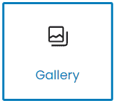
In addition to being able to insert individual images, Gutenberg also allows us to create galleries. To do this we have to enter the Gallery block or type “/gallery” and then press Enter.

After placing the images in the gallery we can change their order by clicking on the buttons: move image forward and move image backward.

We can also replace individual images by clicking on the pencil icon, or delete an image.

By selecting the gallery block we can access other options from the Gutenberg sidebar.
The Gallery Settings allow us to choose how many columns to show (from 1 to 8) and whether or not to crop the thumbnails so as to keep the same size for all images.
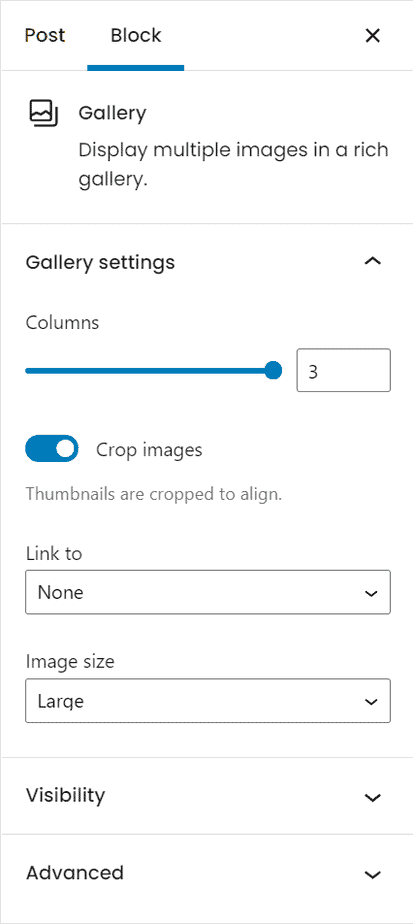
From here we can also change the size of the images and choose whether to insert a link back to the attachment page or the media file.
Again, the Advanced section allows us to add an HTML anchor and allows us to specify additional CSS classes.
If you want to create more customizable galleries, you can use a gallery plugin.
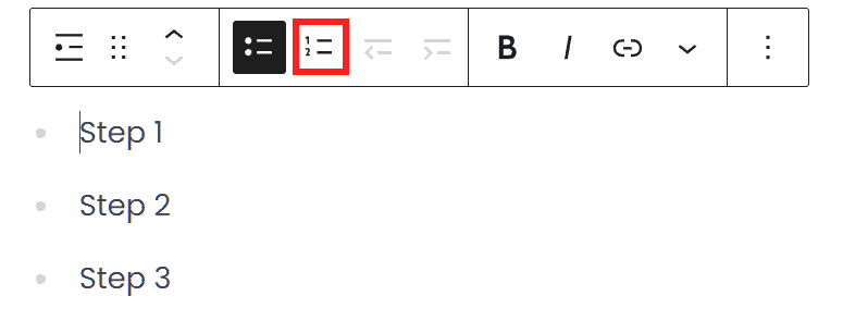
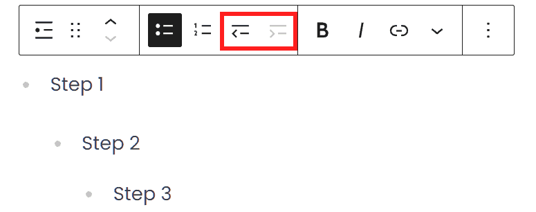
Bulleted or numbered list block
Gutenberg allows us to create two different types of bulleted and numbered lists. To insert it we just click on “+” and choose the “list” block, or type “/list” and press Enter.
By default a bulleted list is created, but we can turn it into a numbered list by clicking on Convert to sorted list.
We can also create nested lists using the Reduce indentation of list items and Increase indentation of list items buttons as seen in this example.
In the toolbar of a list block, we will also see the other functions for formatting (bold and italic) and we will have the possibility to insert links.
From Gutenberg’s sidebar we can access additional options that, as with the paragraph block and title block, also allow us to change the font size, text color and background of the block.

Block Table
Gutenberg allows us to easily create tables. To insert a table block we just click on “+” and then choose the table block, or type “/table” and press Enter.
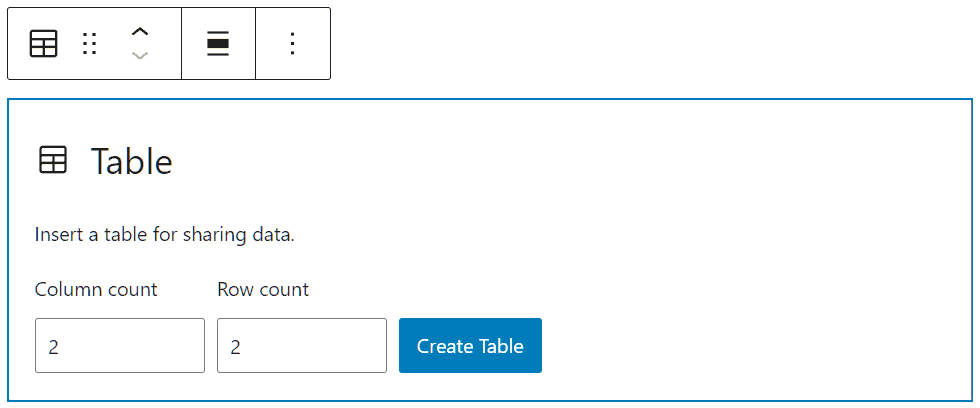
We will then have to choose the number of rows and columns and click on Create Table.
After creating a table, we can click on the Edit Table button on the block toolbar to insert or delete rows and columns.

By clicking on the block tab from the Gutenberg sidebar we can access the Table Settings. From here we can choose whether to set a fixed width for the cells, and choose whether to insert an additional row for the header as a header or footer.
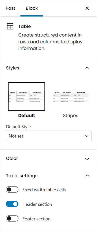
From the Styles section, on the other hand, we can select one of the available styles, usually predefined or stripes.
Block Groups
We can group the Gutenberg blocks into Groups, so we can apply settings for all blocks that are part of the same group. Grouping different blocks can also be useful to move more easily within the article.
In addition, we can also add the group to reusable blocks to use it on different items.
Create a group
To create a group we can insert a group block and then add the various blocks inside it.
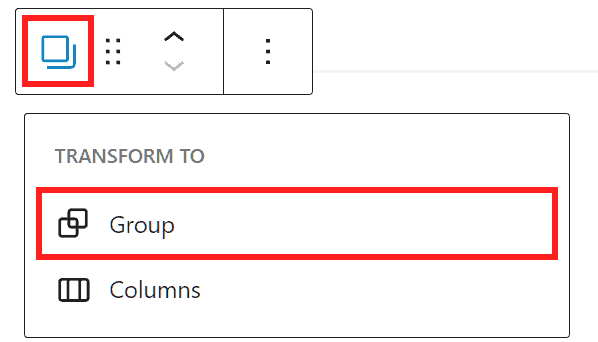
Alternatively we can select several blocks click on Transform into and then click on Group to group them.

Group: toolbar
In the toolbar of the Group block we find the following options:
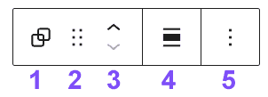
- Change block type or style: this allows us to transform the group into columns.
- Drag: allows us to move the entire group by dragging it.
- Move Up / Move Down: We can move the group.
- Change the alignment.
- Options: allow us to access the options available for single blocks such as copy, duplicate, move to and remove block. In addition from these options we can also add the group to the reusable blocks or separate the group.
Group settings in the sidebar
Remember that you can access the block settings from the sidebar by selecting individual blocks within the group.
By selecting the group we can access the settings from the Gutenberg sidebar. From here we can choose for example the background color for the whole group.
From the advanced options we can access the settings we have seen for the other blocks. Also in the case of groups we can add a CSS class or create an HTML anchor.
Reusable blocks
Reusable blocks are blocks or groups that we can save to reuse in other articles or other pages of the site. Let’s see how to create reusable blocks with Gutenberg and how to insert them into our articles.
Create a reusable block
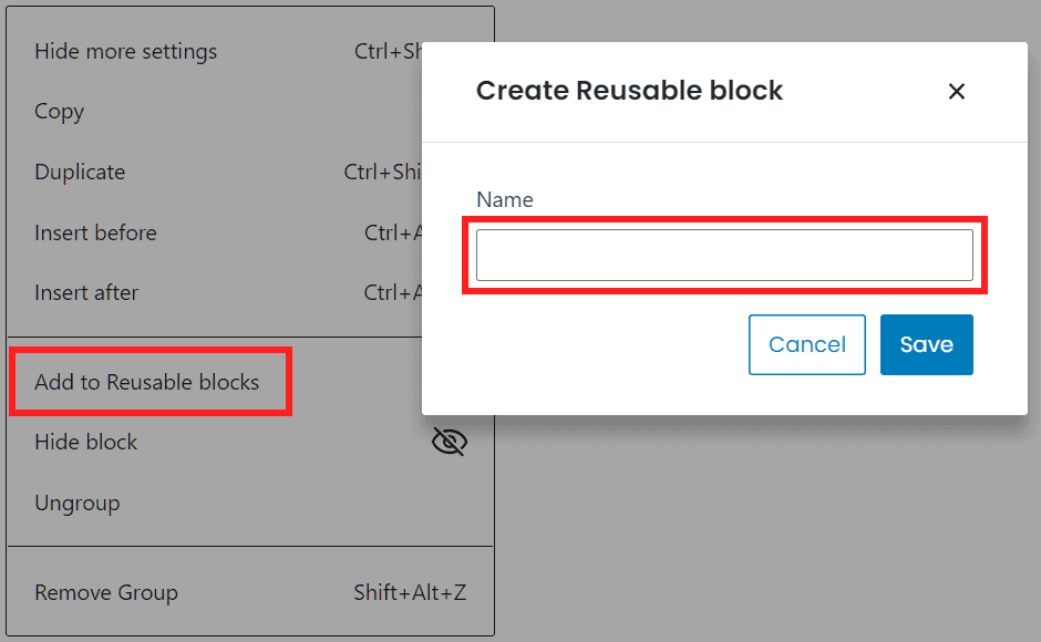
To create a reusable block on Gutenberg, we just need to select the block, group or series of blocks and then click on the options (⁝) then click on Add to reusable blocks.
We will then be asked to enter the name of the reusable block, let’s enter it and click Save.
Insert a reusable block
We have several options for placing a reusable block within the WordPress editor.
We can click on the “+” icon we use to insert a new block and type in the name of the reusable block, we then click on it to insert it.
Alternatively, we can also type “/” followed by the name of the reusable block and press Enter to insert the block.
If we can’t remember what the reusable block we created is called, or if we want to see all the reusable blocks, we can use the block inserter.
Let’s click on the “+” icon from the top bar of Gutenberg. Then we click on the Reusable tab to see the available blocks.
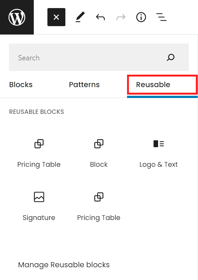
By placing the cursor on the various blocks we can preview them before inserting them into the article or page.
Modify a reusable block
If after inserting a reusable block in the editor we make changes to the block, the changes will be automatically applied to the block, then also to other articles or other pages where it is present.
We can also insert a reusable block and then only edit it in a single item. To do this we simply select the block and click on Convert to Regular Blocks as you see shown in this screenshot.
Models
Templates are predefined blocks made available by WordPress that help us create the content of our articles more quickly.
Add a template
To add a pattern inside the editor we can click on the “+” icon from the top bar of Gutenberg (block inserter). We then click on the Patterns tab and can choose from the drop-down menu the category of patterns available such as buttons, text or gallery.

For example, in the text category we can find templates that let us quickly create two columns of text topped by a title or templates to insert a quote.
Remember that the templates already contain text/images included, so you’ll just need to replace the content.
Plugins and extensions for Gutenberg
If we want to add new blocks to the default Gutenberg ones we can use some WordPress plugins that allow us to add advanced tables, buttons, maps and forms.
These plugins include Kadence Blocks, Advanced Gutenberg and Otter Blocks.
Let’s take Kadence Blocks as an example, after installing and activating the plugin you will see a new button appear in the top bar of Gutenberg, Design Library.

By clicking on it you can view the available elements including tabs, pricing tables and contact forms. Click on an element to place it in the editor, after which you can edit it like a regular block.
Conclusion
In this article, Gutenberg: the complete guide at the WordPress editor, we have seen how to use the WordPress block editor: Gutenberg. We started with a thorough analysis on the classic editor and learned how to disable Gutenberg and reactivate the previous editor.
We’ve seen the settings which enable us to customize the interface and publish articles. We then moved on to actual content creation, saw how to copy content from other editors and how to use the block editor. We then went through an overview of the different types of blocks, saw how to create groups and how to manage templates and reusable blocks. In conclusion we also looked into the plugins available to add new block types.
What about you, do you use Gutenberg to write your content or do you still prefer to use the classic editor? Let me know in the comments below.
Ready to build your WordPress site?
Try our service free for 14 days. No obligation, no credit card required.


