Landing pages are powerful marketing tools that can help you improve your sales or generate leads more effectively.
In this article Landing page: how to create it and which errors to avoid, we’ll first look at what they are and what purpose these landing pages serve. Additionally, we will explore all the tips & tricks for designing successful landing pages and see how to analyze the effectiveness of the pages we have created.
Let’s get started!
Table of Contents
What is a Landing Page?
Landing pages are pages created with a very specific purpose: ;conversion.
This word might not be very clear.
Why did I choose to say “conversion” and not purchase?
It is true that an effective landing page must succeed, but it is also true that there are different purposes.
The two main ones are:
- generate leads
- get customers.
This is why you will hear about landing pages for lead generation and product sales.
Let’s take a closer look at what landing pages are for and how they can be divided into various types based on their intent.
What are Landing Pages used for?
Landing pages are created with a specific goal in mind: to prompt users to take action. The basic structure of these pages is designed to lead the user toward a single action, the famous call to action.
As we’ll see in more detail when we focus on creating landing pages, remember that all unnecessary elements and distractions on the landing page must be eliminated.
Imagine that our goal is to have the user who arrives on our landing page subscrive. The registration form should be a magnet that attracts the user.
In a situation like this, the presence of other elements pushing for different actions would only result in confusing the visitors.
And what does a confused or indecisive user do?
Often, they simply leave the page without taking any action.
That’s the opposite of what we wanted to achieve.
Landing Pages: Single or Multiple Types?
We’ve clarified that there’s only one goal to achieve when we create a landing page.
So, what is it?
The answer depends on us.
We can create landing pages for the direct sale of a product or to generate leads. There are also other subtypes that still fall into these two main categories. Let’s take a look at some examples.
Landing Pages for Direct Sales
One of the most common examples is creating a landing page to sell a product or service.
There’s only one absolute goal here: to complete the sale.
So, the page in question will not aim to generate interest in the reader but to ensure that their interest, which has already arisen during the so-called customer journey, becomes a reality, meaning they buy the product.

We could say that the visitors who reach the page are already potential customers. What they lack is just the “final push” that encourages them to complete the purchase.
That’s why to achieve this, you’ll need to eliminate all obstacles that could disrupt the buying process at this stage.
We will return to this topic in the following sections of this article and see what can help us accomplish this.
Landing Pages for Lead Generation
Another good reason why you might want to create a landing page is to generate leads.
Lead generation, in simple terms, involves persuading the user to provide their contact information. In practice, this could mean asking for a phone number, an email address, and other personal data.

It goes without saying that this is not an isolated activity but rather a first step that will be followed by other strategies to guide the user into becoming your customer.
Creating a contact list with people interested in what you have to offer is, in fact, the first step toward making a sale.
Thank you page
This other category doesn’t strictly fall under landing pages. The “thank you page” is the one displayed to users who have completed an action.
For example, you may have created a landing page to invite users to subscribe to a newsletter. Users who subscribe will then be redirected to a thank you page.
Thank you pages should not be underestimated because, if used effectively, they can persuade the user to take additional steps/actions that contribute to the customer retention process.
How to Create a Landing Page
If you want to create an effective landing page, there are practical guidelines that can help.
To make reading easier, we have divided this guide into mini-chapters.
- In the first chapter, we will see how and what to analyze before designing our landing page.
- In the second, we will move on to the practical part: best practices and mistakes to avoid.
- The third chapter will be dedicated to the structure of your page: What elements can you include?
- In the fourth chapter, we’ll see what tools can help us in the actual creation.
- The last chapter is dedicated to optimization: How do I create landing pages that convert?
Phase 1: Preliminary Analysis
Before you begin, you need an analysis:
- You must define a clear objective.
- You must understand your target audience.
- Finally, you must decide how to bring the audience to your page.
Define Your Objective
If you want your landing page to be effective, you need to know why you’re creating it.
This is the time to ask yourself:
Why am I creating this page? What do I want to achieve?
Answering this question is the first thing to do to define the rest of the strategy and all the subsequent steps.

Do you want to create a page with the goal of having users fill out a contact form?
Do you want users to leave a review for your service?
Whatever the objective, it’s crucial to define it from the outset.
Know Your Audience
If you have a product to sell or a service to offer, you should already know the answer to this question.
However, it’s still worth taking a moment to ask yourself:
Who am I targeting with this specific landing page?
It’s not obvious that your entire audience is interested in this specific page. Are you creating a page for new customers? Or for an audience that already knows you and is already loyal?
Making these considerations will allow you to align your content with your audience.

To create the best possible experience for your potential new customers, you’ll also need to consider their entire journey.
You must have a clear understanding of the entire path users will take to reach the landing page. Only in this way can you maintain a consistent and coherent message that will guide and motivate users to take action.
Imagine the landing page as the destination, and there are different paths that a user can take to get there.
What are the possible paths?
Let’s look at some examples in the next section.
Establish Traffic Sources
It must be clear from the outset that creating a landing page is not enough without considering which traffic sources to use.
Creating the page won’t be sufficient if there are no users who can reach it.
First and foremost, you could use a pay-per-click advertising campaign, such as Google Ads. Google and other search engines allow you to create advertising campaigns and display your site at the top of search results.
Another option is to focus on advertising shown on social media, such as sponsored posts on Facebook.

You can also leverage email campaigns to direct users to your landing pages.
Organic traffic can also be helpful. You might be able to rank among organic search results and generate traffic to your site without resorting to pay-per-click ads.
It’s evident that there’s no one-size-fits-all traffic source, so you must find the one that suits your needs. Choosing the right marketing strategy or strategies is essential to effectively promote the product or service you want to offer.
Phase 2: Practical Tips and Mistakes to Avoid in Creating a Landing Page
After setting your goal and defining your target audience, you’re practically ready to get your hands dirty with design.
But where do you even start to create a well-made landing page?
Although every landing page deserves its own discussion and you’ll need to analyze many factors, including competition, there are some basic rules we can follow in every case.
With these guidelines in mind, it will be easier to steer in the right direction to create a landing page that fulfills its purpose.
Eliminate the Unnecessary by Removing Distractions
Instead of starting with the elements to include on the landing page, you should begin thinking about what’s best to avoid including.
As we mentioned from the beginning, your page must have a clear objective.
It’s not enough for the purpose of the page to be clear to you, it must also be clear to the visitor.
If you can’t achieve this, you will have wasted all your efforts.
Here, we come to the first golden rule:
Eliminate anything that is distracting and unnecessary.
Let’s start with the menu. The navigation menus you typically use on your website serve a specific purpose: to facilitate navigation and allow the user to explore and reach other pages.
That’s why you should not include menus on landing pages.
In this case, you don’t want the user to leave the page, you don’t want them to explore either. There is only one objective, and if you don’t want the user to “escape,” you shouldn’t give them the opportunity to do so.
It’s no coincidence that landing pages are often designed as standalone pages. Sometimes they can even be separate from the main site and have a separate domain.
Grab their Attention with an Effective Opening Message
When you design a landing page and eliminate sources of distraction, you ensure that visitors don’t jump from one page to another without reaching their goal.
However, this doesn’t guarantee that the user will actually take action.
Removing the menu prevents distractions, but how do you truly capture their attention?
This is where the first element of the landing page structure comes into play. The headline, along with visual elements (images or videos), will be the first things the user sees.
The initial impression is the key that opens the door to the reader’s journey. Whether they continue or not, depends on how persuasive you’ve been.
An effective message is essential if you want the visitor to stay and continue reading.
Win people over by clearing every doubt they have
Now that the first hurdle has been cleared, and the visitor has decided to stay on your page, you must guide them toward taking action.
How do you convince them?
The opening message was persuasive enough to keep the user engaged, but now they likely have new questions and uncertainties.
What you need to do through the visual and textual elements of your landing page is to address every possible doubt.

A successful landing page answers all the questions the user may have and clarifies every possible curiosity. That’s why it’s important for the content to contain all the details about what you offer.
To understand what to include, you can use this simple reasoning method. Imagine arriving on a page that is promoting a course: you’re interested in this course and want to know if it’s suitable for you.
Some questions you might ask yourself would be:
- Where will it take place? In-person or online?
- Will I have access to the lessons afterward?
- Do I need to take an exam?
- Will I receive a certification?
- Is the course suitable for me based on my current skills?
These are just some of the questions you might have.
What happens if the page doesn’t provide sufficient clarification? If you’re genuinely interested, you might want to contact the course provider to ask more questions.
This doesn’t always happen, though. You might completely change your mind, give up the idea of taking that course, or seek another course that exactly meets your needs and answers all your doubts.
This example serves to help you understand that when creating a landing page, you should empathize with the audience that will see it. You know the potential of the service you offer, but the person arriving on that page may not have even known your company existed until yesterday.
It’s up to you to give them a valid reason to trust you and, in turn, get in touch with you or become your customer.
Pay Attention to Every Detail
It’s not enough to attract visitors to your page; to convince them to stay, you must provide a solution to their problems.
For your message to be persuasive, you must create pages that are complete in every respect. This means carefully crafting both the headline and the page text and creating suitable visual content.
We’ve already seen what information to include using the example of selling a course. In addition to being clear and comprehensive in the text, you must also be so in the call to action.

Visitors to the page must be guided toward action, and once they get there, they shouldn’t have any doubts.
Would you ever click on a button if you don’t understand what it does? Would you fill out a form if you don’t know why you need to enter your data?
Every element of the page must be consistent with your goal. Therefore, try to eliminate all those factors that could act as obstacles to achieving your goal.
For example, if the contact form requests too much information, and few users complete it, reduce the fields to only what’s necessary.
If the call to action is unclear, and people aren’t sure if they can download the ebook you’re offering for free, provide details explaining that they won’t have to pay anything or try using a different message in the call to action.
As we will see in the upcoming mini-chapters, there are tests that allow us to measure the effectiveness of landing pages and understand where to make improvements.
Don’t Underestimate Performance and Technical Aspects
A landing page that converts must not only be attractive to your audience. You can use impactful messaging, and choose highly effective image combinations, but in the end, you should never underestimate the technical aspects.
What are we talking about?
First and foremost, page loading speed.
Imagine this scenario: You’ve invested a significant budget in creating an email campaign to drive potential customers to your landing page. However, the page is not optimized and has painfully slow loading times, causing users to leave it before even seeing the first content.
The result?
You’ve wasted time and money, and you don’t even have a real insight into the effectiveness of the landing page you’ve created.

In a world that’s moving faster and with increasingly distracted potential customers, it’s important to capture their attention immediately. Unfortunately, you can’t do that if you haven’t optimized loading times.
You can find interesting statistics that show how loading times have a significant impact on bounce rates and conversions in our article on the importance of having a fast website.
Don’t forget that the landing page must be functional and work properly. Before publishing it, you should analyze its usability, ensure that it’s responsive, and conduct all possible tests.
Some questions that can help you include:
- Does the page display well on mobile devices?
- Do all buttons, forms, and page elements work as they should?
- Are there any issues that could affect indexing? Evaluate if you need an SEO analysis to find errors (especially if you want to focus on organic rankings).
- Does the chosen hosting plan provide sufficient resources? If you’re running an extensive campaign, make sure the infrastructure can handle a high-traffic website.
Phase 3: How to Structure the Landing Page?
Now it’s time to delve into the actual structure. What should you include on the landing page?
Keep in mind that every landing page is unique and should be customized based on its purpose. Let’s talk about the elements you can include.
Remember that you don’t always have to include all these elements. For example, if your goal is not to collect contact information, you won’t need a form.
The headline
The headline of your landing page will be the first thing visitors see. It’s important to capture their attention, be persuasive, and make them want to stay on the page to learn more.
Text content
If the headline sparks curiosity by opening up new questions in the reader’s mind, you’ll need to answer those questions on the rest of the landing page. The goal is to provide all the necessary information without making the text too heavy to read and understand.

Be very clear
Be clear, avoid unnecessary words, and use specific information to answer all questions.
Organize Information
Those reading the page don’t yet know what you have to offer. Therefore, try not only to go into detail but also to organize what you have to say logically. Don’t jump from one piece of information to another. Structure the content so that it’s easier for readers to find the key points.
Call to action
What is the goal of your landing page? You need to build the call to action around this goal.
When creating your landing page, make sure your goal is clear to the people who will visit it.
Imagine a potential customer entering a store: they expect to find what they’re looking for right away. They don’t want to go through different rooms or corridors before reaching the shelves where what they want is displayed.
When creating the landing page, you should adopt the same approach: make it clear right away.
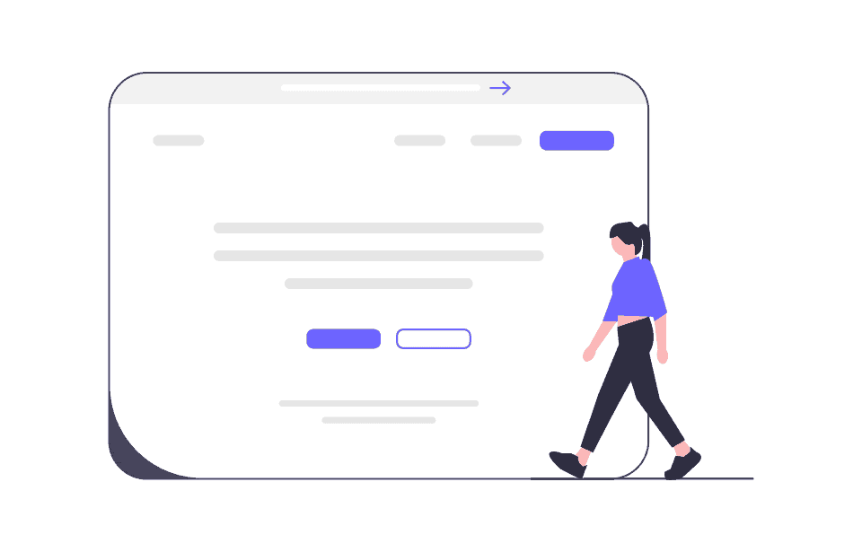
There’s no better way to do this than to use a clear message.
In addition to using clear words in the call to action text, consider placing it above the fold. This means showing it in the section of the page that is visible without the need to scroll down.
Otherwise, you’ll need to ensure that the page is designed to guide users to the call to action, convince them to continue reading, and ultimately take action.
Depending on the landing page’s length and purpose, it can also be helpful to place the CTA multiple times within the page. It’s the same CTA but repeated in strategic locations on the page.
The contact form
If you’re creating a landing page to acquire new contacts, the form is one of the most important elements.
What information do you need? Certainly, the name and email address. But what about other info? Is it necessary to ask for extra information from visitors?

In general, it’s better to keep the required fields to a minimum. Otherwise, it can compromise the effectiveness of the form. More fields mean more time to fill them out, and as a result, you might lose those who are in a hurry or not willing to share too much personal information.
Reviews and Testimonials
Due to the principle of social proof, we tend to give more credibility to products and services that are appreciated by others. This is why reviews are highly valued.
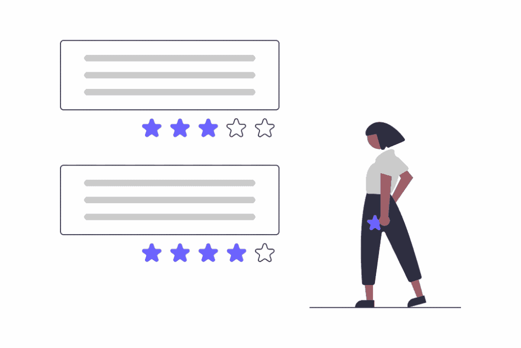
Testimonials are not the only signal you can use, you can also refer to certifications, awards, and other recognitions.
Undoubtedly, the presence of tangible data can help establish the credibility of what you’re offering.
You could include data such as the average review ratings or refer to case study data, letting the numbers speak for you.
Lists and FAQ Section
Another element that can be used in landing pages is the Frequently Asked Questions (FAQ) section.
You can use it to create a persuasive landing page that provides all the answers to user questions.

Another format you can use is a list. Through a list of bullet points, you can make the text more readable and capture your reader’s attention. It’s another way to present important information in a concise manner.
The Thank You Page
This is not an element that is part of the actual landing page structure, but it is a separate page. After a visitor has filled out a contact form, you can redirect them to a thank you page.
If the visitor is supposed to receive something via email or be contacted again, you can use this page to provide confirmation. Additionally, you can encourage visitors to take further actions, such as taking advantage of another offer.
Fase 4: What tools to use to create landing pages?
Now that we’ve laid the foundation for the structure of your page, it’s time to roll up your sleeves and start working.
How do you actually create a landing page? Are there tools that one can use?
Creating landing pages with external tools
There are various landing page builders designed to simplify the creation process. These tools allow you to build pages with a user-friendly editor, eliminating the need for programming knowledge.

One example is the Mailchimp landing page builder.
You could also use the GetResponse landing page creator, which enables you to create custom designs or start from a template.
Alternatively, KickoffLabs offers predefined templates to kickstart your design.
ConvertKit is another builder that offers a free plan with certain limitations, which I recommend checking out.
Unbounce provides a drag-and-drop builder for creating pages and offers basic ready-made templates.
Swipe Pages also offers a simplified system for creating landing pages. The service has various paid plans and a free 14-day trial.
Remember that some builders allow you to create and publish landing pages for free using an internal subdomain instead of purchasing a domain and associating it. However, for a more professional landing page, it’s advisable to use a custom domain.
Creating Landing Pages with WordPress
The external tools we’ve just discussed can, in some cases, be quite expensive. Therefore, you need to consider whether you need the services they offer or if you’d like to avoid a monthly subscription.
A valid, more cost-effective alternative that can offer you greater freedom is WordPress hosting.

With WordPress, you can use various methods to create your landing pages.
For example, you could use a page builder such as Elementor or Oxygen builder to create and customize your pages.
Page builders have the advantage of providing you with pre-made elements that you can later customize. For instance:
- Sections for the call to action.
- Hero images to include in the above-the-fold section of the page.
- Testimonial boxes.
- Contact forms.
Alternatively, you can also create your landing page directly using Gutenberg, WordPress’s block editor. In this case, you can use the editor to create the page and integrate functions with other plugins, such as using Contact Form 7 to create a contact form.
Creating a Landing Page Without Using a CMS
From a technical standpoint, a landing page is just a regular web page. There’s nothing stopping you from creating it in HTML and CSS and using other programming languages to make it dynamic.
If the page is separate from your website and you don’t need to manage it through a CMS, there’s no reason to do this.
In conclusion, the choice of method depends on your needs and your proficiency in using the tools.
Phase 5: How to Measure the Effectiveness of a Landing Page?
You’ve created the landing page, published it, and think the job is done.
Not quite.
Even if you believe you’ve analyzed every detail, remember that everything can be improved.
Fortunately, there’s a practical method to test the actual effectiveness of the page you’ve created.
I’m talking about A/B tests and multivariate testing. We’ve dedicated an entire guide to A/B tests on our blog.
Here, we’ll briefly go over the essentials.

Why should you use this type of analysis to improve your landing page?
An A/B test involves creating two versions of a web page so that version A and version B differ in one element. The goal of this experiment is to determine if changing an element or its position on the page also changes visitor behavior and improves conversions.
Does a different CTA text lead to more clicks? To find out, all you need to do is conduct a test and then analyze the results you obtain.
A/B tests are applicable to various marketing activities, including email campaigns and website creation. When it comes to creating such an important page as a landing page with the goal of conversion, it is vital to do testing and constantly seek improvements.
Here are some examples of elements you can create in multiple versions and subject them to testing:
- CTA text
- Headline
- Text within the page
- Images used
- The presence/absence of a video
- Color combinations (or the color used for the CTA button)
- Arrangement of elements (e.g. placing the CTA at the top of the page)
The possibilities are truly endless. Of course, you don’t have to test every element all at once. You can start with the elements you think may have the greatest impact.
Landing page FAQs
In this section, we aim to address some of the most common questions and doubts about landing pages and their use. You will also find additional resources to assist you in creating a successful landing page.
What’s the difference between a home page and a landing page?
The home page is the initial page of your website, unlike a landing page, the home page must have a navigation menu. It’s important that the main pages of the site are directly linked to the home page.
There will be links in both the main menu and the footer, and there may be various calls to action within the page, perhaps redirecting to products.
Let’s take the home page of SupportHost as an example. At the top, we have the menu that refers to the categories of hosting plans and other services, resources for customers, the blog and so on.
A bit further down, we find shared hosting plans, LiteSpeed hosting and semi-dedicated hosting, each accompanied by a call to action that directs the visitor to the respective pages.
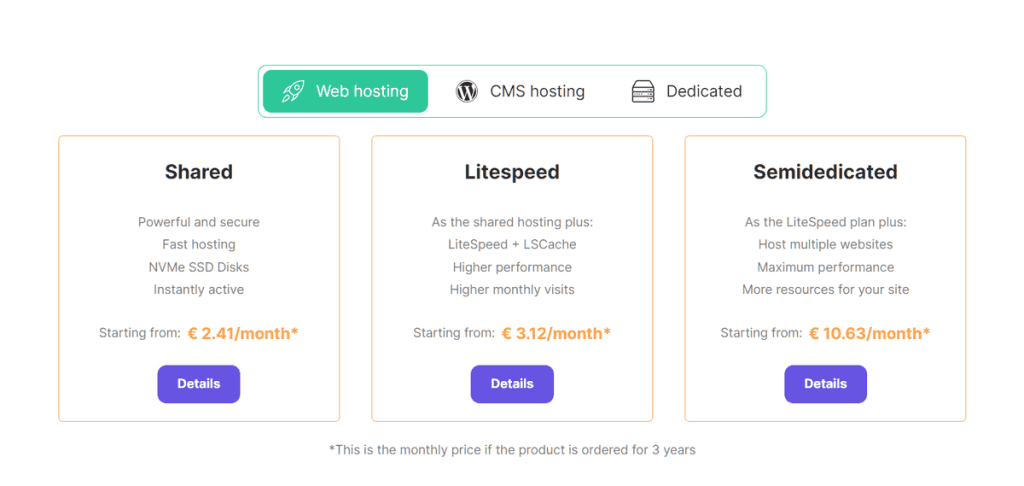
Examples of multiple CTAs on the SupportHost home page.
As you can see, a single page contains numerous links and just as many calls to action.
On a landing page, on the other hand, distractions are minimized, and the goal is to prompt a single action, such as signing up for a single service or activating a free trial.
If you think about it, it is normal that there are differences between a landing page and a home page. The two pages are designed with different purposes in mind and are aimed at different audiences.
Visitors to your site’s homepage are not specifically directed toward a single objective. They might want to visit the blog, take a look at the services you offer, or may have just heard of your brand and don’t even know what you have to offer yet.
In contrast, visitors to a landing page have clearer intentions because they have been directed to a specific page, such as being interested in a free trial of your service.
Where can I find more in-depth resources
In this guide, we’ve tried to cover all the key points for creating a landing page. We’ve discussed analysis, structure, the tools to use, and the subsequent tests to improve your landing page. After reading this, you have the fundamentals to start with.
Where can I find examples of landing pages?
Before creating your landing page, are you curious to see some examples of pages for inspiration?
You could start by taking a look at this extensive list of 110 landing page examples on Instapage. Here, you’ll find pros and cons for each example and suggestions on factors to improve or test.
Additionally, you can check out this list of 21 landing page examples analyzed by Hubspot.
Conclusion
In this article, Landing Page: How to create it and which errors to avoid, we explored everything related to landing pages.We covered the most important elements at the core of their creation. We looked at useful tools, common mistakes to avoid, and methods for optimization.
By now you should have a clear understanding of what landing pages can be used for, what strategy to follow to create a convincing and converting landing page, and what other resources you can rely on.
Have you ever created a landing page? What was the goal you wanted to achieve, and what results did you obtain? Let us know in the comments below.
Ready to build your WordPress site?
Try our service free for 14 days. No obligation, no credit card required.


