
In this tutorial, we’ll learn how to create a custom Gutenberg block.
There are several ways to create blocks, to simplify the procedure and make it understandable to all we will use plain JavaScript. We have chosen to go with this method and not use JSX to avoid compilation.
To be able to follow this tutorial you only need to have basic knowledge of JavaScript, HTML and CSS.
Don’t be intimidated by the current block development documentation, it doesn’t help much, especially if you don’t want to use JSX. I’ll show you how to start building your first blocks right away, using only a code editor and a local WordPress installation.
Let’s begin.
Table of Contents

What is a Gutenberg block?
With Gutenberg the creation of pages and articles for websites takes place by composing the content through blocks. A block, therefore, represents any element within our page.
Gutenberg blocks are defined in the WordPress documentation as units of markup that, when combined, form the content or layout of a web page.
Some of the building blocks are:
- paragraphs
- titles
- Images
- video
- file
- bulleted list.
Unlike the classic WordPress editor, where post content is created in a single window, blocks allow us to break the content into smaller pieces.
The advantage of building in blocks is that the single block can be easily moved to another location. Specifically, we can edit the individual blocks, rearrange them, move them and duplicate them more easily.
JSX VS JavaScript
To create a Gutenberg block we can use JavaScript or JSX. In our case we will use JavaScript, this way we won’t need to recompile the code with npm.
JavaScript is a Java-derived scripting language that is used to make pages interactive. JavaScript is executed directly by the browser when the page loads and does not need to be compiled.
JSX (JavaScript XML) is an extension of the JavaScript syntax that is used to build React components and is similar to the HTML language. JSX expressions must be compiled to become JavaScript functions.
Choosing either method leads to the same result. The difference is that using JavaScript we don’t need to compile. Following this method makes it possible to create a block even for the less experienced.
Our development environment
In our case we chose to use plain JavaScript and not JSX. This choice stems from the intention of creating a tutorial suitable for everyone.
We just need to use:
- local with which we will install WordPress locally;
- a code editor, such as Visual Studio Code.

If we had been using JSX we would have needed a more complex development environment. In that case we would have needed to install:
- Node.js, a framework that is used to create applications in JavaScript;
- npm, the package manager of Node.
How this tutorial is set up
In this tutorial I want to explain how to create a custom block, starting from a basic block to introduce the first concepts.
I’m going to add passages in each block in order to introduce other concepts and thus improve our Gutenberg block one step at a time, in the hope of making everything as clear as possible.
You can follow the tutorial step by step, copying the code creating a new plugin for each block, or download the code from GitHub.
I decided to create a separate plugin for each block for (hopefully) clarity, obviously it would have been possible to create a single plugin for all blocks.
Without saying anything else, let’s start by creating our first block, creating a very basic block, which will help us understand the basic structure of the block.
Our first block, let’s start at the base
So, let’s get to the heart of our tutorial, and start getting our hands dirty with the code.
We have our WordPress site installed locally, and a code editor (I personally like Visual Studio Code since GitHub retired Atom).
We don’t need anything else.
Let’s start by creating a folder for our plugin, which we will call “supporthost-block-1”.
Inside we create a php file called supporthost-block-1.php (the same name as the folder, but obviously with the php extension).
In our php file we insert this code:
<?php
/**
 * Plugin Name: SupportHost block 01
 */

function supporthost_block_01_register_block() {
    register_block_type( __DIR__ );
}

add_action( 'init', 'supporthost_block_01_register_block' );
In practice, in the comment above we give a name to our plugin, and via the “init” action hook we call the register_block_type function to which we just need to pass the location of the folder containing the block.json file, which we now need to create.
Let’s create the block.json file which contains the information of our Gutenberg block:
{
    "apiVersion": 2,
    "title": "SupportHost: 01",
    "name": "supporthost-blocks/supporthost-01",
    "category": "layout",
    "icon": "admin-generic",
    "editorScript": "file:./block.js"
}
What does it mean? These are the basic settings of our block, let’s see them one by one:
- apiVersion: The API version of the block.
- title: the title of the block that is shown when we choose the block.
- name: the unique name that defines our block.
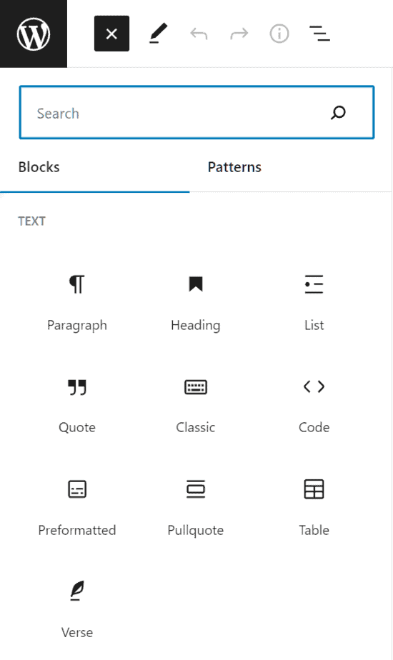
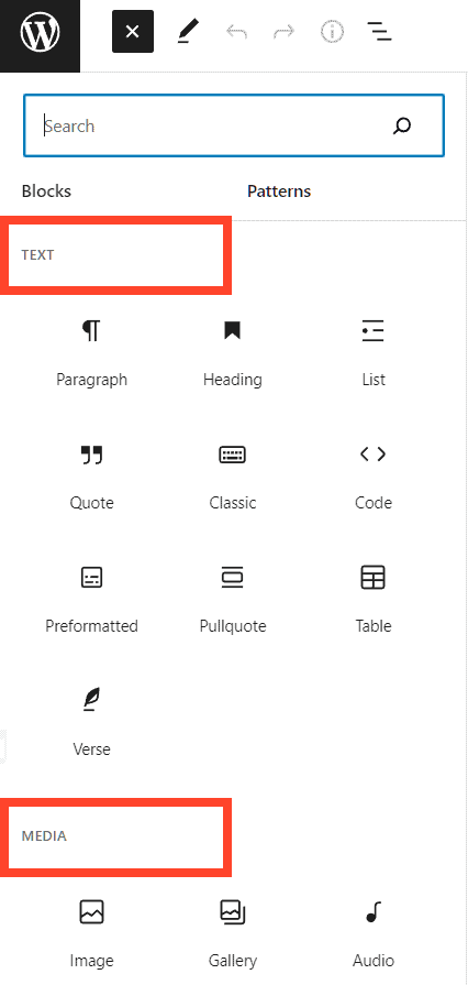
- category: the category in which the block is placed (text, media, design, widgets, theme, embed). The blocks are divided into categories when we click on the blue + in the upper left to open the block inserter.
- icon: the dashicon we want to show as our block icon.
- editorScript: the script we want to load into the editor for our block.
As you probably noticed, in the last line of the block.json file we call a block.js file, but this file doesn’t exist yet.
Let’s create it, paste the code below and see how it works.
( function ( blocks, element ) {
var el = element.createElement;
blocks.registerBlockType( 'supporthost-blocks/supporthost-01', {
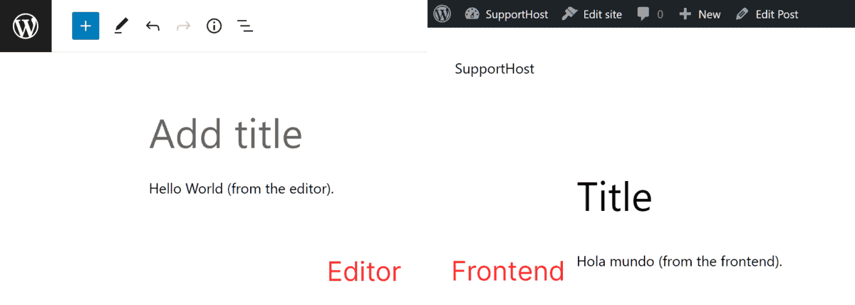
edit: function () {
return el( 'p', {}, 'Hello World (from the editor).' );
},
save: function () {
return el( 'p', {}, 'Hola mundo (from the frontend).' );
},
} );
} )( window.wp.blocks, window.wp.element );
This file is automatically loaded into the editor, and contains 3 important elements:
- name: in line 4 we see that the same “name” that we entered in the block.json file is used.
- edit: the function that is called inside the editor, allows us to see the block in the editor and in the next examples it will contain a code that allows us to modify the contents of the block.
- save: this function is called when we save our content. WordPress saves the HTML code that is created via this function in the database.
As you surely noticed, when you add this Gutenberg block (which obviously isn’t editable, yet) in the editor you see one text, while in the frontend you see different text. You can see the result in the screenshot at the end of this paragraph.
This happens because we instructed our block to show a “p” in the editor, but when we save, the save function saves a “p” with different text in the database, and therefore a different text is shown in the frontend.
Now we can go to the plugins screen and activate our first plugin.

Going to create a new post we should see the new block, yet it is not present. How come? The dependencies are missing.
In the WordPress documentation we read:
To register the block you need a php file for the assets, in the same folder as the folder used in register_block_type() and it must start with the filename of the script.
Basically we have to create a block.asset.php file in the same folder, with this code:
<?php return
    array( 'dependencies' =>
        array(
            'wp-blocks',
            'wp-element',
            'wp-block-editor',
            'wp-polyfill'
        ),
        'version' => '0.1'
    );
A note on reloading the page. When you are working on a block, and the files (css and js) change, it is ideal to delete the block, save and do a hard refresh to reload any cached files. On Mac to hard refresh just press shift+cmd+r
Now you can reload the header page and add the first custom block in your post.

Of course it’s useless for now, in the sense that we can add a block, which is shown in two different ways on editor and frontend, and we can’t edit it.
But this is only a first step. Let’s add the first brick to give our Gutenberg block better graphics: CSS.
Let’s add the CSS to our block
Duplicate the supporthost-block-1 folder and call it supporthost-block-2.
We similarly rename supporthost-block-1.php to supporthost-block-2.php and change the code inside it like this:
<?php
/**
 * Plugin Name: SupportHost block 02
 */

function supporthost_block_02_register_block() {
    register_block_type( __DIR__ );
}

add_action( 'init', 'supporthost_block_02_register_block' );
Basically replacing the number 1 with the number 2.
In the block.json file we add two lines with respect to the previous plugin file:
{
    "apiVersion": 2,
    "title": "SupportHost: 02",
    "name": "supporthost-blocks/supporthost-02",
    "category": "layout",
    "icon": "admin-generic",
    "editorScript": "file:./block.js",
    "editorStyle": "file:./editor.css",
    "style": "file:./style.css"
}
- editorStyle: we indicate the path of the css file that will be loaded in the editor. Note that this file is loaded after the block stylesheet, so it is used to show different styles in the editor.
- style: here we indicate the path to the style sheet of the block, this file will be loaded in both the frontend and the backend, as I said above it is loaded before the editor style sheet.
I also changed the block title and name to be different from the first block we created, and WordPress doesn’t mix up blocks. Similarly we need to change the name of the block in the block.js file
Since we are calling two css files, let’s create them and add the necessary code.
editor.css:
/* green background */
.wp-block-supporthost-blocks-supporthost-02 {
    background: #090;
    color: white;
    padding: 20px;
}
style.css:
/* red background */
.wp-block-supporthost-blocks-supporthost-02 {
    background: #900;
    color: white;
    padding: 20px;
}
Now let’s activate the plugin and add the block on Gutenberg, obviously after doing a hard refresh of the page.
Surely you have noticed that the css have no effect, even though the files are loaded correctly.
This is because we need to add a class to the “p“, both in the editor and in the frontend.
To do this we need to edit the block.js file like this:
( function ( blocks, element, blockEditor ) {
    var el = element.createElement;

    blocks.registerBlockType( 'supporthost-blocks/supporthost-02', {
        edit: function ( props ) {
            var blockProps = blockEditor.useBlockProps();
            return el(
                'p',
                blockProps,
                'Hello World (from the editor, with css).'
            );
        },
        save: function () {
            var blockProps = blockEditor.useBlockProps.save();
            return el(
                'p',
                blockProps,
                'Hello World (from the frontend, with css).'
            );
        },
    } );
} )( window.wp.blocks, window.wp.element, window.wp.blockEditor );
We basically use blockEditor.useBlockProps() to add a class to the block. The class that is added is the name (name) of the block that uses the symbol “-” instead of the slash “/”, it is a simple convention.
The WordPress documentation also shows a second way to inline style the block, I’m not going to explain it here, first because it’s simple, second because soon our stylesheets will become complex and it makes no sense to use inline styles in that case.
Obviously, we have modified the graphic part, but our block is completely useless if we cannot modify the text from the editor.

Let’s see how the attributes and editable fields work.
Editable attributes and fields
As with the previous block, we duplicate the folder of one of the blocks, change the various names to 3 to have unique names.
We activate the SupportHost block 03 plugin and start modifying our files in order to create an editable block.
The file to edit is the block.js file
Let’s start by adding the attributes. In practice we define the attributes of our Gutenberg block, in this case only “content”, in a later example we will add more than one.
        attributes: {
            content: {
                type: 'string',
                source: 'html',
                selector: 'p',
            },
        },
We are basically creating an attribute called content, which is a text string, inside an html “p” tag.
Source indicates the source from which we get the attribute value, in this case we get the value from the HTML which is saved in the database by the save function.
We also need to define “example”, which defines the default data for the preview when we try to add the block via the inserter.

It is not mandatory to define example, if we don’t we see a message that the preview is not available.

To define an example we must indicate default values for each attribute we have created, like this (you will see other examples in the next blocks):
        example: {
            attributes: {
                content: 'Hello World',
            },
        },
Note that the attributes and examples can also be placed in the block.json file, to maintain some consistency between the various blocks we create in this tutorial, I add them in the block.js file
The edit function changes a lot compared to the previous examples, since we now use richtext, let’s see it together:
        edit: function ( props ) {
            var blockProps = useBlockProps();
            var content = props.attributes.content;
            function onChangeContent( newContent ) {
                props.setAttributes( { content: newContent } );
            }

            return el(
                RichText,
                Object.assign( blockProps, {
                    tagName: 'p',
                    onChange: onChangeContent,
                    value: content,
                    placeholder: 'Insert text here...',
                } )
            );
        },
First we have a new variable called content, which takes the value of the content attribute.
Then we have an “onChangeContent” function which assigns a new value to the content variable with each modification of the block content.
Finally our return, which returns a richtext, here we see:
- blockProps: a JavaScript object which in this case contains the class we assign to the paragraph.
- tagName: the html tag of the block we are creating, or of this section of the block.
- onChange: which calls the “onChangeContent” function. In this way, every time we make a change, it is recorded in the variable and shown as a value.
- value: The value of the editable field, in this case the value of the text field.
- placeholder: the text to show when we add the block, like all placeholders, disappears to make room for the text as soon as we start writing our text.
The save function should be self-explanatory at this point, here is the final result of our block.js file:
( function ( blocks, blockEditor, element ) {
    var el = element.createElement;
    var RichText = blockEditor.RichText;
    var useBlockProps = blockEditor.useBlockProps;

    blocks.registerBlockType( 'supporthost-blocks/supporthost-03', {

        attributes: {
            content: {
                type: 'string',
                source: 'html',
                selector: 'p',
            },
        },
        example: {
            attributes: {
                content: 'Hello World',
            },
        },
        edit: function ( props ) {
            var blockProps = useBlockProps();
            var content = props.attributes.content;
            function onChangeContent( newContent ) {
                props.setAttributes( { content: newContent } );
            }

            return el(
                RichText,
                Object.assign( blockProps, {
                    tagName: 'p',
                    onChange: onChangeContent,
                    value: content,
                    placeholder: 'Insert text here...',
                } )
            );
        },

        save: function ( props ) {
            var blockProps = useBlockProps.save();
            return el(
                RichText.Content,
                Object.assign( blockProps, {
                    tagName: 'p',
                    value: props.attributes.content,
                } )
            );
        },
    } );
} )( window.wp.blocks, window.wp.blockEditor, window.wp.element );
Let’s give a graphic to our block, with the style.css file:
.wp-block-supporthost-blocks-supporthost-03 {
    border-left: 7px solid #6754e2;
    padding: 10px 10px 10px 1.5em;
    font-style: italic;
    margin: 3em 0;
    box-shadow: 0 2px 12px 0 rgb(0 0 0 / 5%), 0 0 35px 0 rgb(0 0 0 / 5%), 0 30px 100px -40px rgb(0 0 0 / 15%);
}
While we can leave the editor.css file blank.
We created a block like this, to add a featured note in our blog.
It’s time to give some color to our block.
Gutenberg block supports
In a very simple way we can add support for basic colors (text, background and links) for our block.
To do this, as before we duplicate the folder for supporthost-block-3 making it 4, then we modify the block.json file to have this code:
{
    "apiVersion": 2,
    "title": "SupportHost: 04",
    "name": "supporthost-blocks/supporthost-04",
    "category": "layout",
    "icon": "admin-generic",
    "editorScript": "file:./block.js",
    "editorStyle": "file:./editor.css",
    "style": "file:./style.css",
    "supports": {
        "color": {
            "text": true,
            "background": true,
            "link": true
        },
        "typography": {
            "fontSize": true,
            "lineHeight": true
        },
        "align": true,
        "spacing": {
            "margin": true,
            "padding": true,
            "blockGap": true
        }
    }
}
Let’s define “supports” in the json file, let’s see what these entries are for:
- color: you have the possibility to choose different colors, in this case I have enabled the possibility to choose the color of the text, the background color and the color of the links.

- typography: gives us the possibility to choose the font size and the height of the line spacing.

- align: adds the possibility to set the width of the block, this control is not found in the sidebar, but in the toolbar directly inside the editor.

- spacing (dimensions): allows us to add margin, padding and gap tools for our block.

For more details and other supported options check out the WordPress documentation, here I have only included the ones I think are the most common and useful.
It is important to change the name of the selector in the style.css file so that it works correctly with this Gutenberg block.
Text alignment
Let’s duplicate the last Gutenberg block we created once again, change the number from 4 to 5 and add another function, which will allow us to check the alignment of the text.
First, we need to add an attribute that we will call “alignment”:
        attributes: {
            content: {
                type: 'string',
                source: 'html',
                selector: 'p',
            },
            alignment: {
                type: 'string',
                default: 'left',
            },
        },
Let’s add the value in the example:
        example: {
            attributes: {
                content: 'Hello World',
                alignment: 'left',
            },
        },
Inside the save function we create a variable for “alignment” and a function to set the new value of the variable when the alignment is changed.
            var alignment = props.attributes.alignment;

            function onChangeAlignment( newAlignment ) {
                props.setAttributes( {
                    alignment:
                        newAlignment === undefined ? 'left' : newAlignment,
                } );
            }
Finally inside the edit function return we have to add a block, in this case the function return gets complicated because we have to return some “nested divs”
            return el(
                'div',
                blockProps,
                el(
                    BlockControls,
                    { key: 'controls' },
                    el( AlignmentToolbar, {
                        value: alignment,
                        onChange: onChangeAlignment,
                    } )
                ),
                el( RichText, {
                    key: 'richtext',
                    tagName: 'p',
                    style: { textAlign: alignment },
                    onChange: onChangeContent,
                    value: content,
                } )
            );
For the “save” function instead we use the alignment attribute to add a class, then through the style.css file we set the alignment correctly.
        save: function ( props ) {
            var blockProps = useBlockProps.save();

            return el(
                'div',
                blockProps,
                el( RichText.Content, {
                    tagName: 'p',
                    className:
                        'supporthost-block-align-' +
                        props.attributes.alignment,
                    value: props.attributes.content,
                } )
            );
        },
And let’s add this code to the style.css file:
.supporthost-block-align-left {
    text-align: left;
}

.supporthost-block-align-center {
	text-align: center;
}

.supporthost-block-align-right {
	text-align: right;
}
As with the other blocks, we can activate the plugin, hard refresh the editor and use the block, in this case the SupportHost 05 block.

But how can we have more fields, to create a more complex Gutenberg block?
A review block
Let’s take as an example the boxes we use on the SupportHost review site:

To do something similar, what I would do is use Gutenberg’s column block, then create a block with 3 different inputs, one for name, one for position/profession, and one for review.
Let’s see how we can create such a block.
First of all we duplicate the new plugin and change the various names to go from 5 to 6, this will be our block number 6.
As before we need to add 2 new attributes, one for the name and one for the location:
        attributes: {
            name: {
                type: 'string',
                source: 'html',
                selector: '.supporthost-testimonial-name',
            },
            position: {
                type: 'string',
                source: 'html',
                selector: '.supporthost-testimonial-position',
            },
            content: {
                type: 'string',
                source: 'html',
                selector: '.supporthost-testimonial-content',
            },
            alignment: {
                type: 'string',
                default: 'center',
            },
        },
As you probably noticed, in this case as “selector” we don’t use an HTML element, but a class, so that we have a unique selector for each attribute.
As we did before let’s add the entries to our example:
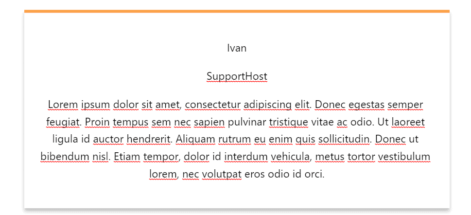
        example: {
            attributes: {
                name: 'Ivan',
                position: 'SupportHost',
                content: 'Lorem ipsum dolor sit amet..',
                alignment: 'center'
            },
        },
I’ve shortened the value of content for simplicity in this example.
Now we have to go and modify the edit and save functions, first adding the variables for name and position, and the functions for updating the value with the onChange function:
            var name = props.attributes.name;
            var position = props.attributes.position;

            function onChangeName( newName ) {
                props.setAttributes( { name: newName } );
            }
            function onChangePosition( newPosition ) {
                props.setAttributes( { position: newPosition } );
            }
So let’s add the code in the return:
                el( RichText, {
                    key: 'richtext',
                    tagName: 'p',
                    style: { textAlign: alignment },
                    onChange: onChangeName,
                    value: name,
                    placeholder: 'Insert name here...'
                } ),
                el( RichText, {
                    key: 'richtext',
                    tagName: 'p',
                    style: { textAlign: alignment },
                    onChange: onChangePosition,
                    value: position,
                    placeholder: 'Insert position here...'
                } ),
We do the same for the save function as well, like this:
                el( RichText.Content, {
                    tagName: 'p',
                    className:
                        'supporthost-testimonial-name supporthost-block-align-' +
                        props.attributes.alignment,
                    value: props.attributes.name,
                } ),
                el( RichText.Content, {
                    tagName: 'p',
                    className:
                        'supporthost-testimonial-position supporthost-block-align-' +
                        props.attributes.alignment,
                    value: props.attributes.position,
                } ),
The complete code of block.js is:
( function ( blocks, element, blockEditor ) {
    var el = element.createElement;
    var RichText = blockEditor.RichText;
    var useBlockProps = blockEditor.useBlockProps;
    var BlockControls = blockEditor.BlockControls;
    var AlignmentToolbar = blockEditor.AlignmentToolbar;

    blocks.registerBlockType( 'supporthost-blocks/supporthost-06', {

        attributes: {
            name: {
                type: 'string',
                source: 'html',
                selector: '.supporthost-testimonial-name',
            },
            position: {
                type: 'string',
                source: 'html',
                selector: '.supporthost-testimonial-position',
            },
            content: {
                type: 'string',
                source: 'html',
                selector: '.supporthost-testimonial-content',
            },
            alignment: {
                type: 'string',
                default: 'center',
            },
        },
        example: {
            attributes: {
                name: 'Ivan',
                position: 'SupportHost',
                content: 'Lorem ipsum dolor sit amet, consectetur adipiscing elit. Donec egestas semper feugiat. Proin tempus sem nec sapien pulvinar tristique vitae ac odio. Ut laoreet ligula id auctor hendrerit. Aliquam rutrum eu enim quis sollicitudin. Donec ut bibendum nisl. Etiam tempor, dolor id interdum vehicula, metus tortor vestibulum lorem, nec volutpat eros odio id orci. Donec vitae suscipit orci. Vestibulum ante ipsum primis in faucibus orci luctus et ultrices posuere cubilia curae; Ut malesuada luctus lectus, at ullamcorper dolor tempor in. Sed sed ex ullamcorper, convallis elit et, interdum elit. Etiam massa magna, cursus eget lorem vel, varius malesuada nibh. Donec non enim interdum, pellentesque enim efficitur, scelerisque turpis. Fusce lacus nulla, consectetur sed orci quis, luctus interdum nisi.',
                alignment: 'center'
            },
        },

        edit: function ( props ) {
            var blockProps = useBlockProps();
            var name = props.attributes.name;
            var position = props.attributes.position;
            var content = props.attributes.content;
            var alignment = props.attributes.alignment;

            function onChangeName( newName ) {
                props.setAttributes( { name: newName } );
            }
            function onChangePosition( newPosition ) {
                props.setAttributes( { position: newPosition } );
            }
            function onChangeContent( newContent ) {
                props.setAttributes( { content: newContent } );
            }

            function onChangeAlignment( newAlignment ) {
                props.setAttributes( {
                    alignment:
                        newAlignment === undefined ? 'center' : newAlignment,
                } );
            }

            return el(
                'div',
                blockProps,
                el(
                    BlockControls,
                    { key: 'controls' },
                    el( AlignmentToolbar, {
                        value: alignment,
                        onChange: onChangeAlignment,
                    } )
                ),
                el( RichText, {
                    key: 'richtext',
                    tagName: 'p',
                    style: { textAlign: alignment },
                    onChange: onChangeName,
                    value: name,
                    placeholder: 'Insert name here...'
                } ),
                el( RichText, {
                    key: 'richtext',
                    tagName: 'p',
                    style: { textAlign: alignment },
                    onChange: onChangePosition,
                    value: position,
                    placeholder: 'Insert position here...'
                } ),
                el( RichText, {
                    key: 'richtext',
                    tagName: 'p',
                    style: { textAlign: alignment },
                    onChange: onChangeContent,
                    value: content,
                    placeholder: 'Insert review here...'
                } )
            );
        },

        save: function ( props ) {
            var blockProps = useBlockProps.save();

            return el(
                'div',
                blockProps,
                el( RichText.Content, {
                    tagName: 'p',
                    className:
                        'supporthost-testimonial-name supporthost-block-align-' +
                        props.attributes.alignment,
                    value: props.attributes.name,
                } ),
                el( RichText.Content, {
                    tagName: 'p',
                    className:
                        'supporthost-testimonial-position supporthost-block-align-' +
                        props.attributes.alignment,
                    value: props.attributes.position,
                } ),
                el( RichText.Content, {
                    tagName: 'p',
                    className:
                        'supporthost-testimonial-content supporthost-block-align-' +
                        props.attributes.alignment,
                    value: props.attributes.content,
                } )
            );
        },

    } );
} )(
    window.wp.blocks,
	window.wp.element,
	window.wp.blockEditor
 );
We need some tweaks to the style.css file so that the block looks nice. Let’s make the font size larger than the name, while decreasing the font size of the location and review text:
.wp-block-supporthost-blocks-supporthost-06 {
	border-top: 5px solid #fca249;
	padding: 25px;
	transition-property: all;
    transition-duration: 0.5s;
    box-shadow: 0 5px 6px 0 rgb(0 0 0 / 23%);
}

.supporthost-testimonial-name {
	margin-top: 30px;
	font-weight: 700;
	font-size: 1.25em;
}

.supporthost-testimonial-position {
	margin-top: 15px;
	opacity: 0.75;
	font-size: 0.75em;
}

.supporthost-testimonial-content {
	margin-top: 15px;
	font-size: 0.75em;
}

.wp-block-supporthost-blocks-supporthost-06:hover {
	transform: scale(1.05,1.05);
}

.supporthost-block-align-left {
    text-align: left;
}

.supporthost-block-align-center {
	text-align: center;
}

.supporthost-block-align-right {
	text-align: right;
}
And we’re ready to use the block, obviously only after activating the plugin and hard refreshing the editor page.
And if we want to add an image?
Create a block with an image
If we want to add an image to a Gutenberg block, we need to add 2 different attributes, one for the image ID and one for the url.
We will need to add a new dependency in the block.js file, components.
And of course modify the edit and save functions.
Let’s begin.
After we’ve duplicated the plugin and changed the names to give it a new number, let’s add the new dependency like this:
( function ( blocks, element, blockEditor, components ) {

...

} )(
    window.wp.blocks,
    window.wp.element,
    window.wp.blockEditor,
    window.wp.components
 );
Let’s add the 2 attributes we need for the image:
        attributes: {
            mediaID: {
		type: 'number',
	    },
	    mediaURL: {
		type: 'string',
		source: 'attribute',
		selector: 'img',
		attribute: 'src',
	    },
            name: {
                type: 'string',
                source: 'html',
                selector: '.supporthost-testimonial-name',
            },
            position: {
                type: 'string',
                source: 'html',
                selector: '.supporthost-testimonial-position',
            },
            content: {
                type: 'string',
                source: 'html',
                selector: '.supporthost-testimonial-content',
            },
            alignment: {
                type: 'string',
                default: 'center',
            },
        },
And as in the other cases we add the same data in the example:
        example: {
            attributes: {
                name: 'Ivan',
                position: 'SupportHost',
                content: 'Lorem ipsum dolor sit amet...',
                alignment: 'center',
                mediaID: 1,
		mediaURL: 'https://images.unsplash.com/photo-1549150712-1d243024db80?ixlib=rb-4.0.3&ixid=MnwxMjA3fDB8MHxwaG90by1wYWdlfHx8fGVufDB8fHx8&auto=format&fit=crop&w=1480&q=80',
            },
        },
In this case, I’ve used a link to an image on an unsplash to show in the preview, hoping it won’t be deleted, in case the preview will show a missing image.
Here too I shortened the content of content, to simplify the code.
Now let’s add the variable and the function for the image inside the edit function:
            var mediaID = props.attributes.mediaID;
            var mediaURL = props.attributes.mediaURL;

            var onSelectImage = function ( media ) {
		return props.setAttributes( {
			mediaURL: media.url,
			mediaID: media.id,
		} );
	    };
The next step is to add the code in the return of the edit function to show the button to add an image directly in the block.
I decided to show a picture before the name, the picture of the person leaving the review.
el(
    'div',
    { className: 'supporthost-testimonial-image', style: { textAlign: alignment }, },
    el( MediaUpload, {
        onSelect: onSelectImage,
        allowedTypes: 'image',
        value: mediaID,
        render: function ( obj ) {
            return el(
                components.Button,
                {
                    className: mediaID
                        ? 'image-button'
                        : 'button button-large',
                    onClick: obj.open,
                },
                ! mediaID
                    ? 'Upload Image'
                    : el( 'img', { src: mediaURL } )
            );
        },
    } )
),
Similarly we need to modify the return of the save function:
el(
  'div',
  { className: 'supporthost-testimonial-image supporthost-block-align-' + props.attributes.alignment, },
  el( 'img', { src: props.attributes.mediaURL } )
),
For reasons of simplicity, I suggest you download the file from GitHub to check the complete code.
To have a nicer graphic effect I added some css code to the previous style.css file, in detail I added:
.supporthost-testimonial-image img {
    border-radius: 100%;
    max-width: 125px;
    border: 3px solid #000;
}
And to better arrange the image in the editor I added in the editor.css file:
.supporthost-testimonial-image img {
    margin-top: 50%;
}
This is what the two blocks we created for the reviews look like. The one on the left is the previous example, without an image, and the one on the right is the one where we inserted the image.
Here’s how we see our two blocks in the editor:
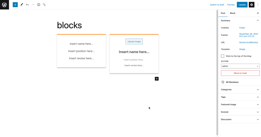
And here I show you the Gutenberg blocks we created with an example where we put text and images:

Also, I don’t know if you noticed that in the previous block the name, location and review text didn’t have a style, in this block I fixed it by adding the different classes like this in the HTML of the editor.
className: 'supporthost-testimonial-name',
Up until now we have been creating static blocks, but how can we take data from the live database and create dynamic blocks?
For example, how can we do if we want to show the list of the last 10 posts?
Create a dynamic block
You don’t need the save function to create a dynamic block. In fact, the data is taken in real time from the database, and it would not make sense to write the list of the last 10 posts in the database.
Let’s start by creating a folder that we will call “supporthost-block-8” and the related file “supporthost-block-8.php”.
The php file will have this code:
<?php
/**
 * Plugin Name: SupportHost block 08
 */

function supporthost_block_dynamic_render_callback( $block_attributes, $content ) {
    $recent_posts = wp_get_recent_posts( array(
        'numberposts' => 3,
        'post_status' => 'publish',
    ) );

    if ( count( $recent_posts ) === 0 ) {
        return 'No posts yet';
    }

    $return = '<ul>';
    foreach ( $recent_posts as $post ) {
        $return .= sprintf(
            '<li><a class="wp-block-my-plugin-latest-post" href="%1$s">%2$s</a></li>',
            esc_url( get_permalink( $post['ID'] ) ),
            esc_html( get_the_title( $post['ID'] ) )
        );
    }
    $return .= '</ul>';

    return $return;
}

function supporthost_block_08_register_block() {

    register_block_type( __DIR__ , array(
        'render_callback' => 'supporthost_block_dynamic_render_callback'
    ) );

}
add_action( 'init', 'supporthost_block_08_register_block' );
The first function “supporthost_block_dynamic_render_callback” is the callback function.
In other words, it is the function that searches for the latest posts in the database, and returns the HTML code that we will display in the editor and in the frontend of the site.
The “supporthost_block_08_register_block” function, as for the other blocks, is used to register the block, calling the block.json file with the difference that here we pass in the second paragraph an array to call the callback function.
Let’s create the block.asset.php file and insert this code:
<?php return
    array( 'dependencies' =>
        array(
            'wp-blocks',
            'wp-element',
            'wp-block-editor',
            'wp-polyfill',
            'wp-server-side-render'
        ),
        'version' => '0.1'
    );
Since we want to use serverSideRender to see identical widget in both editor and frontend.
We create the block.json file, which as for the other blocks contains the information of the block, in our specific case:
{
    "apiVersion": 2,
    "title": "SupportHost: 08",
    "name": "supporthost-blocks/supporthost-08",
    "category": "layout",
    "icon": "admin-generic",
    "editorScript": "file:./block.js",
    "editorStyle": "file:./editor.css",
    "style": "file:./style.css"
}
Since I’m naming the files style.css and editor.css, I create them but leave them blank for now.
I create the block.js file with the following code:
( function ( blocks, element, serverSideRender, blockEditor ) {
        var el = element.createElement,
        registerBlockType = blocks.registerBlockType,
        ServerSideRender = serverSideRender,
        useBlockProps = blockEditor.useBlockProps;

    registerBlockType( 'supporthost-blocks/supporthost-08', {

        edit: function ( props ) {
            var blockProps = useBlockProps();
            return el(
                'div',
                blockProps,
                el( ServerSideRender, {
                    block: 'supporthost-blocks/supporthost-08',
                    attributes: props.attributes,
                } )
            );
        },
    } );
} )(
    window.wp.blocks,
    window.wp.element,
    window.wp.serverSideRender,
    window.wp.blockEditor
);
Basically, we only have the edit function, which returns the code we generate with the php callback function.
If you’ve followed the tutorial up to here, this code should be self-explanatory.
We define some variables and have a return for the edit function.
Conclusion
In this tutorial we learned how to create custom Gutenberg blocks using JavaScript. We started with a basic example to understand the structure of a block.
With more and more complex examples we have seen the potential of blocks and what they allow us to do.
Now you should have the basis to create the blocks according to your needs.
Is everything clear? Were you able to follow the tutorial and create some new blocks? Let me know with a comment.
Ready to build your WordPress site?
Try our service free for 14 days. No obligation, no credit card required.


